Creating an app today is a serious business. You have an opportunity to make your business available to more people and potential customers.
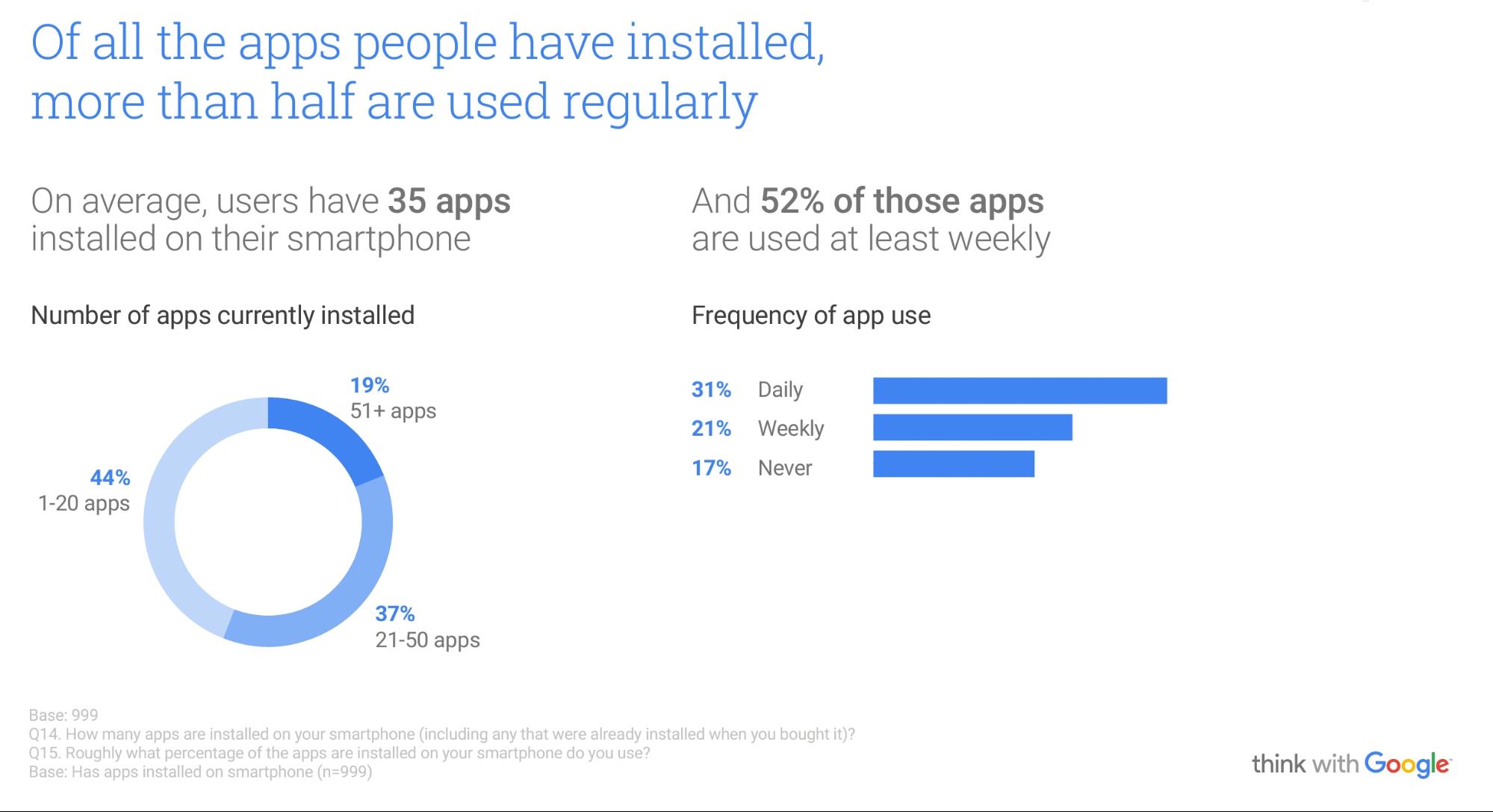
With an average smartphone user having an average of 35 apps on their device and using 52% of them weekly, you get a chance to attract more users.
However, when you consider that there are about 3.3 million apps on Google’s Android Play Store and about 2 million on Apple app store, then you know there’s a lot of competition to get your customers to download your application and use it.
With an app landing page, you can get more leads for your business and downloads for your app. But there are steps you need to take so that you don’t waste your effort with a landing page that fails to convert.
In this guide, I’ll show you important steps you need to follow to create a high-converting landing page for your app.
Use the right landing page builder
There are usually two options when you decide to build a landing page: either you write code for it or use a landing page builder.
If you’ve seen how much it costs to hire a developer (hint: it’s expensive!) you’ll understand why code-free solutions are preferable.
Using a landing page builder is the easier option as you can use its drag and drop editor or a landing page template specifically made for apps. This would make your life easier and your landing page better. What are some landing page builders you can use to build your app landing page?
Instapage: this is one of the most popular landing page builders you can find today. You can find templates for a mobile app landing page which you can browse through and select a suitable one. This service also allows you to perform A/B tests on elements on your landing page.

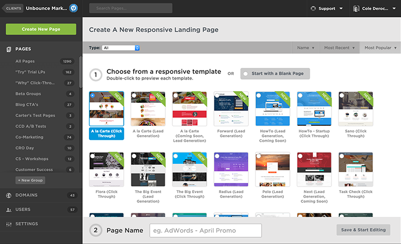
Unbounce: Even though it may be expensive if you’re only building a single page, it’s a robust choice if you don’t mind the cost. It provides many features like testing and integrations with email marketing software packages.
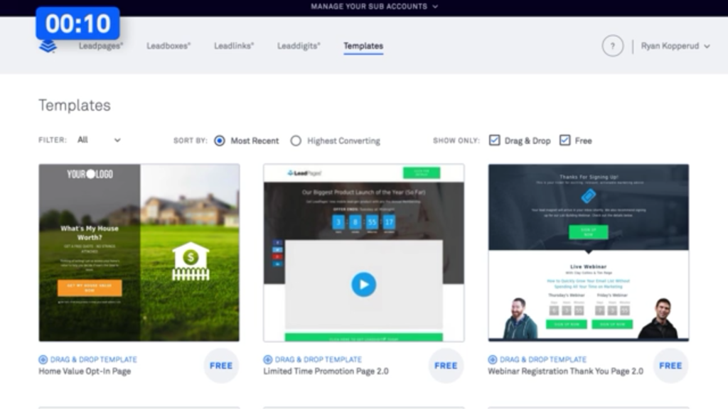
LeadPages: This is one of the most popular landing pages. It provides more than a hundred templates and you can also sort landing pages based on their conversion rates to pick a proven template.
Pagewiz: You have access to templates on this builder and you can also use its drag and drop builder to build your landing page. It also has competitive pricing if you’re on a tight budget.
GetResponse: if you’re looking for a service that can host your landing page and also serve as an email marketing software to process your leads, then GetResponse is your best option.
This means there is no need for integrations and it makes your work easier. In fact, for the bigger plans, you also have access to the CRM feature.
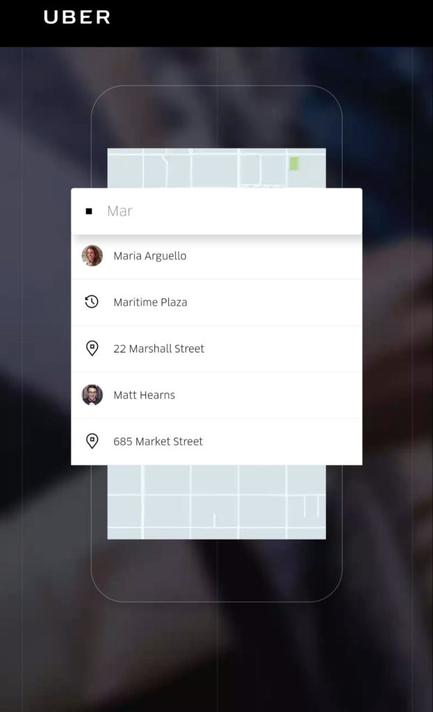
Another benefit you get with a landing page builder is that you can have a mobile-optimized landing page. Since this is a mobile app, your traffic will almost exclusively be from mobile devices.
A mobile responsive page is more attractive to visitors and has a higher probability of showing up. Below is a part of Uber’s landing page when you view on mobile. It has a clear view on mobile.
Have the most important page elements
To increase your landing page conversions, there are important elements that must be present on your page. These elements are:
i). Images: These are visual elements that show your app. These show the most important features on your app interface.
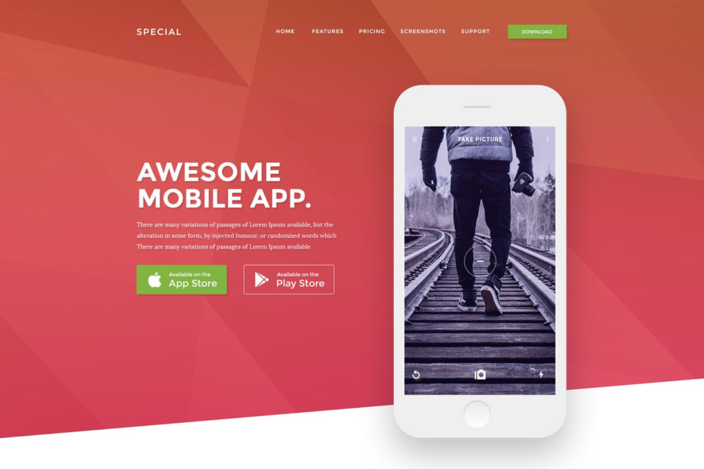
It is important that you display these images to give visitors a glimpse of what they’ll experience on your page.
ii). Download icons: it is necessary that your app is on the two most popular app stores. Also, it’s important to have their icons on your page so that they can follow the link to download your app.
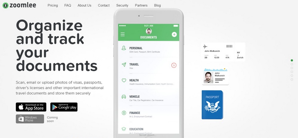
iii). Benefits: To convince people to give you their email address or download your app, you have to preach the benefit of your app on that landing page.
iv). Features: Even after listing your app’s benefits, you still have to list the features that lead to those benefits.
v). Video: If you want visitors to your landing page to see how your app works, you can have a video that shows all the important features you want them to see.
Dr. Muscle app, with the addition of a video on their landing page, were able to increase their conversions by 46%.

vi). Call to action: Your landing page is incomplete without your call to action as this is what encourages your visitors to submit their personal information to you. Your call to action will depend on the offer on your landing page.
If you’re offering a guide on how to use your app, then “Get my Guide” could be a proper call to action. If you want them to go to another page, a CTA like “Learn More” could be appropriate.
Below is an example of a landing page by Hike. This shows the benefits of the app and the call to action button.
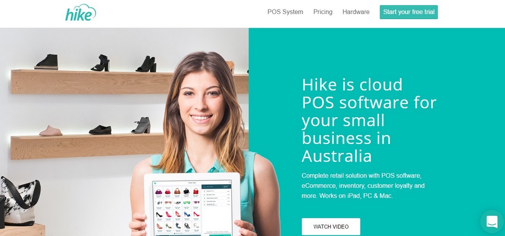
When you scroll down the page, you’ll see the benefits of the app, its features and different stores you can use it.
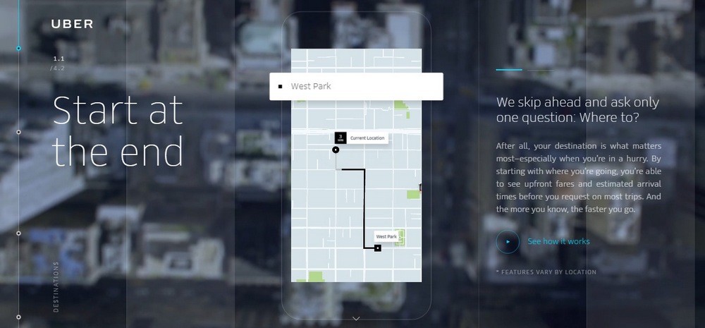
Below is another example of a landing page by Uber. The landing page attracts you with the most important benefit you need to know about the app. You even gain insights on how to design your own app and make it successful as well.
It summarizes the function of the app in a few sentences. If you scroll down the page, Uber used its call to action many times but it maintains the same words “See how it works.”
Remember that you only have a few seconds to grab the attention of your visitors. Your landing page must speak directly to their needs. If writing isn’t your thing, consider working with a professional copywriter to craft a compelling landing page.
Perform A/B tests
No landing page is perfect. No matter how good your design is, you can always improve your page’s conversion by changing some elements on it.
One other reason A/B tests are also important is that you have to know what works for your business. What do your customers react to? What do you need on the page to convert them?
To perform A/B tests, some landing page builders make the feature available. Some elements of your landing page you can test are:
- Headline
- Images
- Background
- Page copy
- Form fields
- Call to action button color
- Call to action button words
Viadeo, formerly known as Soocial, is a job recruitment service and app. By adding the words “It’s free” in front of its CTA, it was able to increase the conversion rate by 28%.

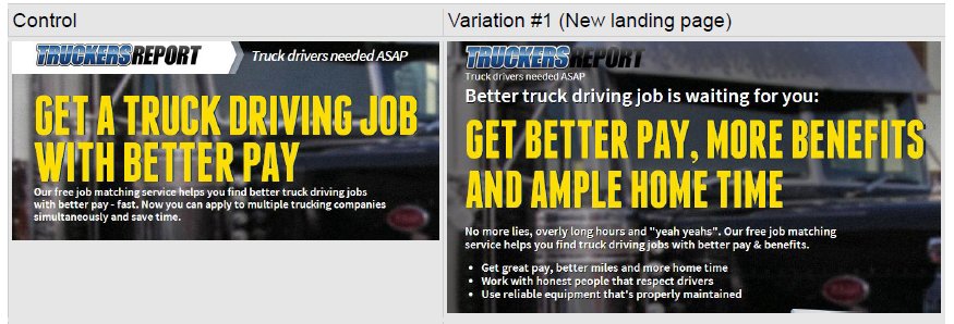
With a series of tests on its landing page, TruckersReport were able to improve their landing page conversions by 79.3%.
Optimize it for search engines
When writing your landing page copy, you must optimize it for Search engines. To do this, you need to perform keyword research.
What are your potential customers likely to search for? This will be related to the problem your app can solve for its users. Likewise, you should also optimize for your brand name as this is easier to rank than other keywords.
Some tools you can use for keyword research are:
- Ubersuggest
- Google Keyword Planner
- Ahrefs
- SEMRush
These tools give you the volume of a keyword and this gives you insight into the words your potential customers are using to search.
Study your competitors
If you’re creating a landing page today, you have to realize that this has been done before by competitors that make similar apps to yours. One of the steps you need to take is to go to their landing page and see what they have on it.
There are two aims of studying your competitors:
- To copy what they have done right
- To avoid what they have done wrong
If you’re thinking about an idea that no one has ever implemented, then you may not find it. If a strategy is working for a competitor that has a similar business, it’s more likely to work for you since you have similar customers.
Add testimonials (social proof)
One of the best ways to make your landing page attractive for visitors is to include testimonials. This shows your visitor that people have used your product to solve the problem they’re trying to solve.
This is a form of social proof that helps to increase trust in your business. For your testimonials, you should know that the more popular the person on your testimonial is, the better.
Likewise, for some segments, testimonials from industry experts will give your app the needed boost.
For your testimonials, the unwritten rule is that you must include the most important 4 elements: the picture of the person giving the testimonial, their name, their testimonial, and their place of work.
Below is an example of a testimonial on Marucci’s landing page. It has many others below just to show customers who have benefitted from its service.

Conclusion
Creating an app landing page that converts requires that you understand your audience. With the understanding of your audience, you can follow these tips and improve your landing page conversions.
Your landing page could be the difference between a lost visitor and a gained customer. Or rather, a new app download. You need to give your landing page the attention it deserves.
About the Author — Michael Chibuzor is a mobile marketer and digital strategist. He’s part of a London-based mobile app development company, Appdigitally.com. When he’s not in a business meeting, he’s busy creating articles for the company.

One thought on “The Definitive Guide to Creating a High-converting App Landing Page”