 Here at AppInstitute, we’re always striving to make apps built using our app builder look as professional, sleek and modern as possible. To do this, we update our platform frequently with new design and navigation options that add a little extra to the look and feel of our apps. One of the latest editions is: you guessed it, transparency.
We added transparency to two places, your header bar, and your navigation menu. First, I’ll talk through header bar transparency.
Header Bar
When editing your colour scheme you’re able to choose between Basic or Advanced settings.
Advanced Colour Scheme Settings
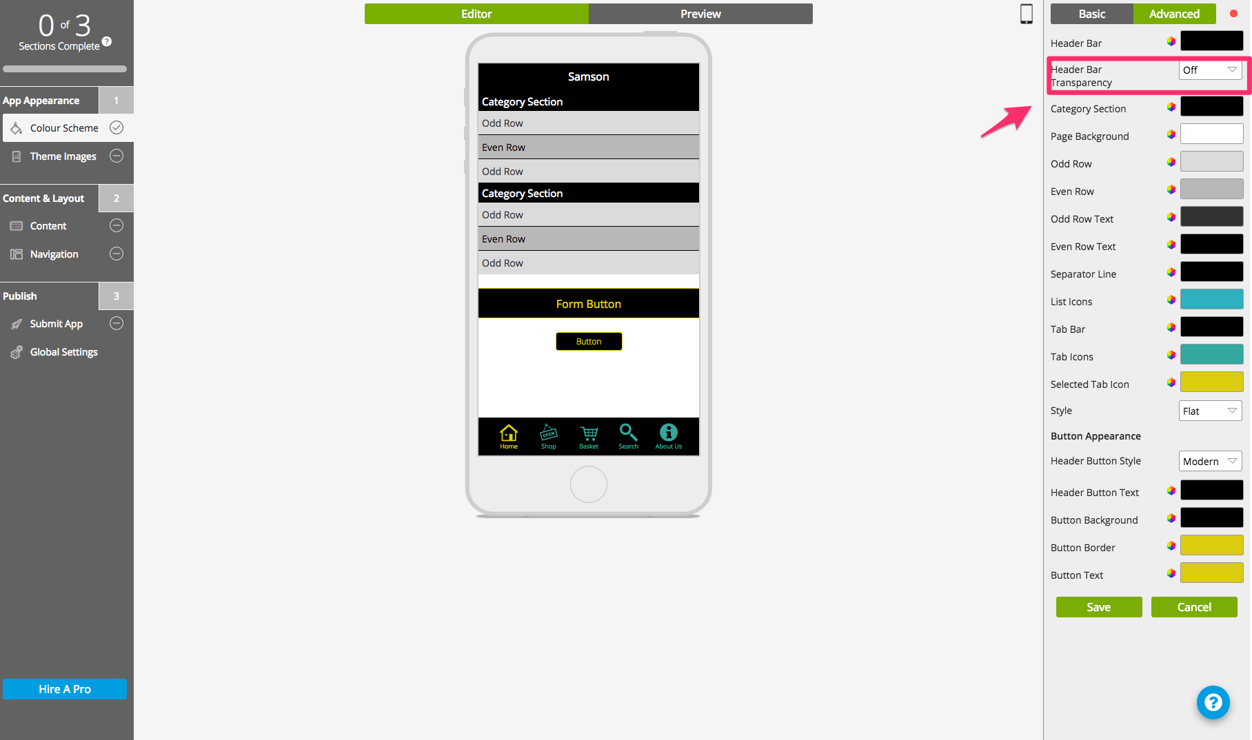
In advanced settings, you can change the colour for each individual element of your app. The option for changing your header bar transparency is just below header bar colour. You can pick between having your header completely solid, by choosing ‘Off’, or completely invisible at 100%. The transparency is completely granular, and you can select any level of transparency between 0 and 100% in intervals of 10%.
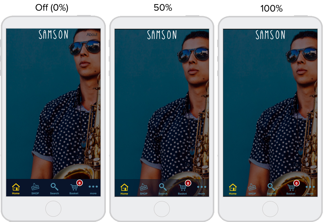
Below, you can see how each level of transparency looks on your header bar.
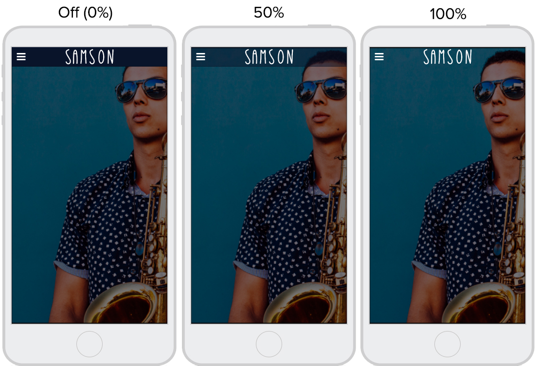
Depending on the colour scheme and design of your app, a transparent or semi-transparent can give it a modern, minimalistic and clean look.
Side Bar
As well as the ability to edit transparency levels of your header bar, we added this option to your navigation type. Whether you’re using the Tab Bar or Side Menu, you have complete granular control over transparency for your navigation menu. The option is on the right-hand side menu in the navigation section of the CMS.
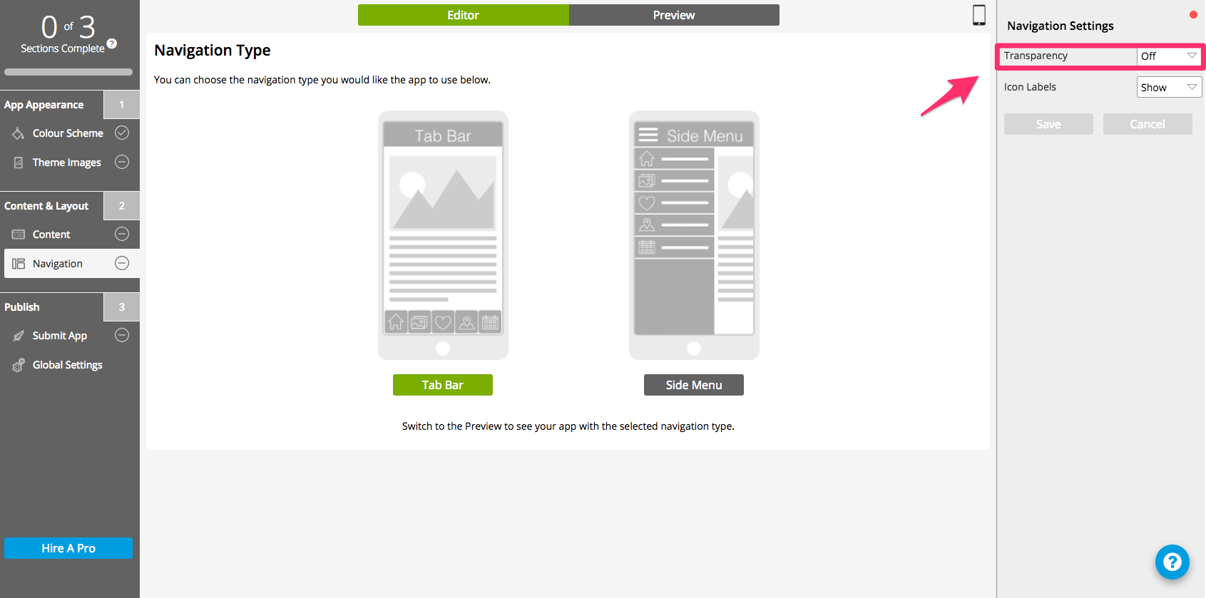
Customisation options for Side Menu are a slightly more detailed – for more information check out this guide.
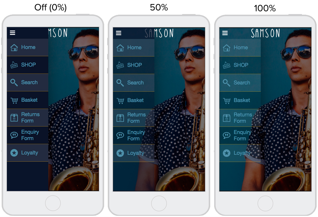
Below, we’ve included some examples of how transparency will look at 0%, 50% and 100% on the Side Menu.
Tab Bar
Although Tab Bar has slightly fewer customisation options, the transparency can still be toggled in the same way as Side Menu. The option is located in the same place, on the right-hand side of the CMS.
Below are some examples of how your Tab Bar menu will look with transparency off, at 50% and at 100%.
Tips for Using Transparency in Your App
It’s important to consider how using transparency will affect the user experience on your app. Whilst a sleek transparent side menu can really add to the look and feel of your app, you should make sure it doesn’t interfere or clash with other aspects of your app.
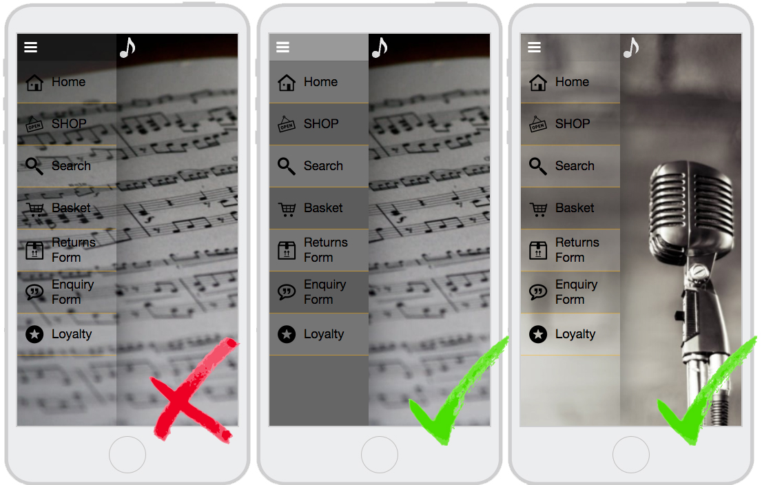
For sidebar menus above 30% transparency, we recommend using plain splash screen image on your home tab so the text on your menu is clear. If your splash screen is quite detailed, it might be better to use a non-transparent menu.
Having the transparency set too high on a side menu may also cause text in your app to clash with menu text. Make sure that this doesn’t happen by checking all your tabs in preview mode before deciding on your transparency level. Below are a few examples of good and bad implementations of the side menu.

0 thoughts on “Feature Spotlight: Transparency”