Hey, you.
Yes, you with the lousy screenshots for your app store listing. It’s time to up your game, and I’m pretty sure you agree. How can I be so sure? Because you’re reading this post called “App Store Screenshot Guide: Creating Better App Store Screenshots” So, call it a hunch.
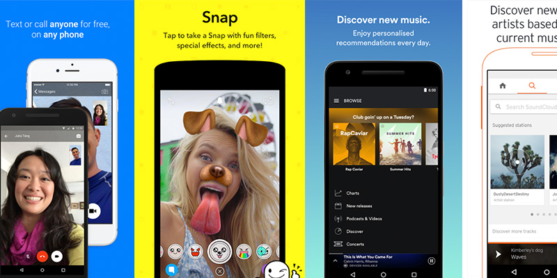
In any case, the point is that having a bad screenshot is like an actor having a bad head shot. If you don’t look the part, that’s the end of that. Like it or not, that visual element is the first lasting impression your app will make. Before someone can even know what your app will do for them, they’re going to see a screenshot and think, “Do I even want to look at this thing?” If you’re not putting your best face forward, people will just keep scrolling.
It’s not as simple as just grabbing an image and throwing it into the listing, though. The best app screenshots are enhanced in some way, usually by adding some text or other visuals to provide context to the image. The fact is, enhanced screenshots increase the likelihood of a download by over 30%, and there are free tools out there dedicated to just this purpose.
But what works? There are no hard and fast rules—what looks good is subjective, after all—but there are things you can do to make your screenshot pop enough to grab attention, and appealing enough to hold it. Let’s take a look at some of the examples and see why they’re so effective.
1. Flipboard Social News Reader (iTunes, Google Play)
Apple’s App Store and Google Play are awash with customisable newsreaders, and searching for one can leave users with a paralysis of choice. Flipboard differentiates itself by adding a social component, but it’s a feature that needs explaining. While the developers wisely use the description section of the app’s listing to detail what that means, they also made sure to highlight its unique features with its screenshots.
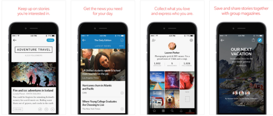
The first two images show off the app doing its core function: displaying news. It gives prospective users a chance to see the app’s visual design—they get to see an attractive minimal design with easy to read text, and understand there’s an organised news feed they can scroll through. The third image demonstrates not only what a user profile in the app looks like, but that there’s even a user profile to begin with. Finally, the fourth one gives an example of how the social features can be a used. Here, a group “magazine” consists of content curated by and shared amongst a small group of people. At this point, someone looking through the listing knows everything they need to about what Flipboard does and why they’d want to use it. And it only took four images and 32 words.
2. Prisma Photo Editor (iTunes, Google Play)
This app was just named App of the Year for 2016 on the iTunes store, so you know they’re doing something right. Sure, it wasn’t their screenshots that earned the developers this distinction, but look at what they’re using currently to give you an idea of why they’re important.
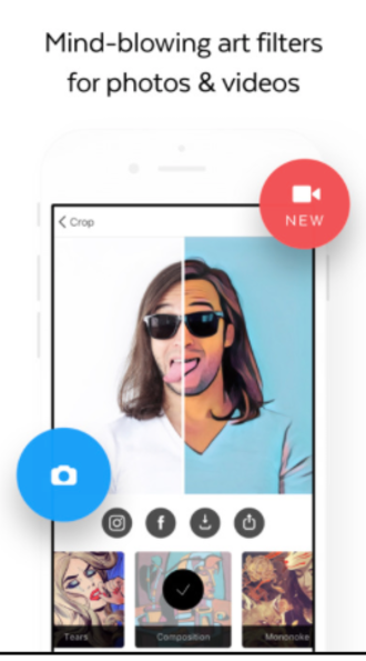
In addition to showing you a before and after in a single image, this screenshot is also telling you that the video editing function is new—something they’ve only recently added. They could have just used the text above to convey that you can edit video with the app, but by overlaying those two icons—the still camera on blue, the video camera on red with the word “NEW”—app store browsers know this is an app that is current. The developers are continuing to add new features and staying on top of their listing, as well. There are tons of one-off apps that sit in the app store untouched by its creators after launch, and this is a very proactive way of communicating that yours is not one of those apps.
3. Daily Classifieds (iTunes)
This simple app aggregates classified ads from Craigslist and Backpages and offers the kind of management tools that you can’t get using those actual websites. In order to showcase these features, the makers of Daily Classifieds use their screenshots to act as a kind of mini-tutorial on how to use the app.
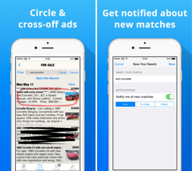
In the image on the left, it’s clear that users don’t have to go searching for buttons to save or remove ads. It’s just a matter of circling or crossing-off with a finger. On the right, they show you exactly where to go if you want to receive notifications about new, relevant ads. When a brand new user knows how to work your app before they’ve even downloaded, you’re several steps ahead of the game.
4. eBay (iTunes, Google Play)
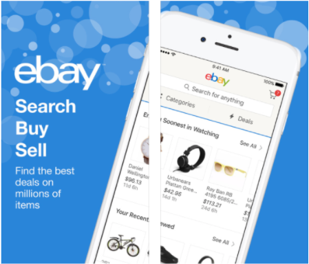
eBay is as old as the dotcom revolution itself, which means they’ve successfully adapted to (or innovated) all the e-commerce advances over the last 20 years. Part of their success is based on their vision of what’s possible, and that shows in the way they showcase their app on iTunes and Google Play.
Each app store has its own guidelines on image size for screenshot uploads, which eBay considered—and then ignored. Here they’ve used two images to create a panorama of sorts. This gave them the space to actually create a design that wouldn’t have been as attractive if they had to stuff it into the portrait orientation of a single frame. The resulting image is well composed, with multiple font sizes. There’s a simple background of blue with variously sized and shaded circles to add depth. The effect of this is to make the actual screenshot pop in the foreground. These are the kinds of design tricks that are the norm everywhere but in an app store, where space is generally tight.
You can see from these examples that there’s more to think about than just which screens you should showcase. You benefit from not only showcasing what your app does, but showing people how they can use it, and giving concise explanations of why they’d want your app in the first place. All of this needs to be done within tightly defined stylistic parameters. Because of these rules, you’ll want to use a specialised tool that guides you through what each app store expects. Photoshop’s not going to cut it this time. For app store optimised images that comply with each store’s style requirements, check out our own free screenshot maker, and start getting most out of your app listing.

2 thoughts on “App Store Screenshot Guide: Creating Better App Store Screenshots”