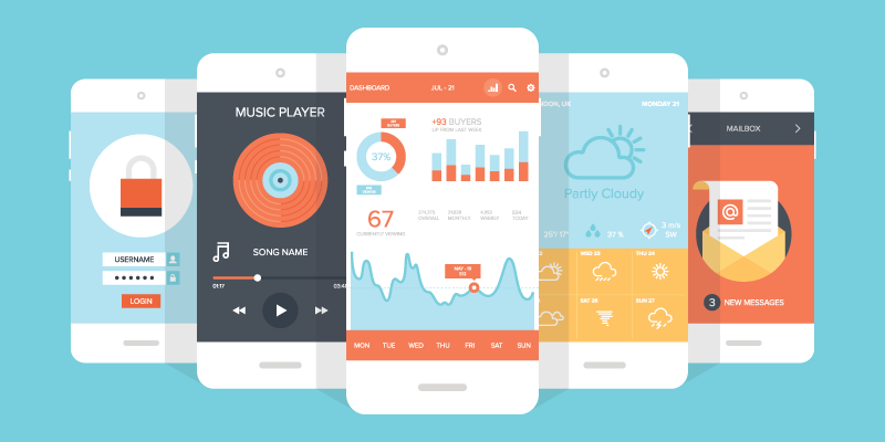
If a picture is worth a thousand words, then an App screenshot is worth a thousand downloads. In fact, even more than a thousand. In this guide, we look at some of the best examples of App Promotion and share the best strategies on how to create engaging screenshots that will increase your downloads by promoting the best features of your App.
How to Get Started
The best way to pick App screenshots for promotion is to choose the ones that best explain what your App does. Major App Stores give you as many as five images to communicate the real purpose behind your App through screenshots.
How you send the real message behind your App, across your audience, matters the most. Is your App about a retail business or a hair salon? Whatever it does, the features should be clearly understood by your potential users.
Free App Screenshot Maker Tool
Looking at the effect screenshots have on users, App screenshots are now considered as advertising banners for engaging users. They are billboards that sell your Apps to people who are not necessarily looking for your App in particular. That is why optimising your store listing is not complete unless you precisely devise an App screenshot strategy. It also boosts organic user acquisition on the App store along with individual marketing efforts.
App Screenshot Maker allows you to create incredibly stunning looking App screenshots within minutes. If you want to focus on the best aspects of your mobile App, our App Screenshot Maker will help thousands of people to notice the most important features your App offers.
Do some research on how your rival Apps have highlighted important features through screenshots. With the tips that we have outlined above, start optimising your screenshots with our App Screenshot Maker to trigger more downloads.
Describe the Main Screens
The most important and commonly used screenshot is the ‘main screen’ capture. This screenshot illustrates the main screen of your mobile App, with a considerable amount of content for the user to know how the App can affect their life. Apps should offer a clear screenshot of the main screen to spell out its purpose.
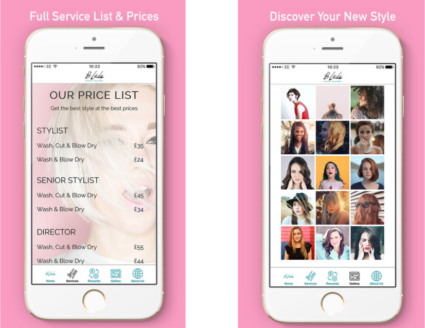
Blade Hair Salon shows what kind of services are provided to the users. Ways to contact the salon are also listed for users to call the salon or seek directions.
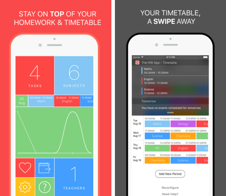
This homework App displays its most important screen for giving users a clear idea of what the App does.
All features such as maintaining a timetable and keeping track of your homework is apparent from the screenshots. This also tells us that the more efficiently designed the App is, the easier it is to explain its features with the help of screenshots.
Add some Text
As new trends have emerged to design App screenshots, another trend has developed in the App screenshot promotion strategy to use the available space for illustrating each particular app screenshot. This is why developers shrink their screenshots in order to create some extra room for additional descriptive text to add more to a screenshot.
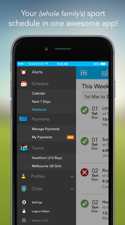
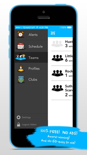
TeamStuff makes use of the extra text strategy. It creatively places the text in the bottom right corner instead of the conventional overhead two-liner for making descriptive app screenshots that explain what the App does.
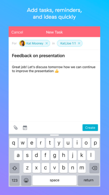
Asana, also briefly describes what the App screenshot demonstrates. This helps the users to easily understand what the App is all about.
Offer a Mini-Tutorial
You can use your App screenshot images to give your users a tutorial for explaining the functionality that may not be obvious to a common user.
As you may already know the success of your App does not just rely on its look. If it looks great but does nothing useful it has no chances of scoring good reviews. Fewer reviews mean less downloads. Once you have developed a useful App that is guaranteed to affect how people live and function in their daily lives, promote it with a screenshot that outlines this process.
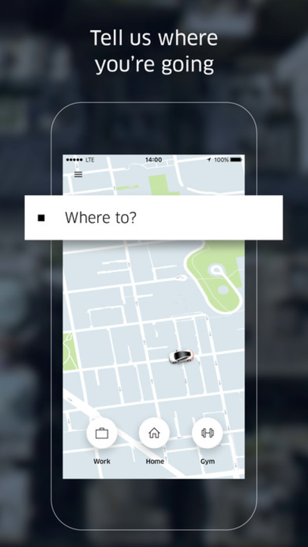
Uber which is a carpool App does a great job at highlighting how it works. The screenshots are almost like a mini-tutorial that explains how convenient it is to avail the service offered via the App.
Focus on User-Experience
When choosing App screenshots for promotion, it is important that you must include the screens users will frequently use in your App. This will give them a clear idea of how the entire user-experience will be. If the App is designed intuitively, then the smooth user-experience will be reflected in the screenshot as well. This goes a long way in attracting new customers and retaining loyal ones.
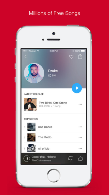
For instance, in the first couple of screenshots of iHeartRadio, we see images of songs being played. Other screenshots highlight that you can save preferences and other notable features that make them stand apart from their rivals.
This is great for attracting even those users who may be just looking and not shopping.
App Store Optimisation (ASO) is a strategy that works much like SEO. However, it is specifically applied to App pages for promoting Apps. Over the past few years, App store screenshots have become a valuable addition to an App Maker and developer’s marketing efforts to help increase an App’s visibility as well as trigger downloads.
ASO comprises of several important elements that help improve your App’s discovery and downloads. That is why promotional screenshots of a mobile app are guaranteed to communicate a clearer message to all visitors who come across the App in App Stores rather than straight-forward screenshots.
App stores have experienced quite a revolution, as App screenshots have taken over App descriptions by pushing them into the background. App screenshots have taken a prominent place both on the front page on the App search as well as the App page itself.
Reflecting on how important App screenshots are for App promotion, Apple has recently released a new update that will make it much easier for developers to upload screenshots via iTunes Connect.
The change will allow developers to submit only one set of screenshots and optional app preview per device family. Earlier, developers had to upload screenshots for each different iPad and iPhone variant.
Visual communication seems to sell faster than descriptions and features. That is why emphasising on your App’s design helps you to get visually appealing screenshots to trigger more downloads.

One thought on “How to Make Engaging App Screenshots for your Business App”