In case you still don’t know what progressive web apps actually are, we recommend giving this post a read. It outlines some of the finer details. But very simply, progressive web apps are an amalgamation of app-like features accessible without installing a native app. It looks like an app, loads like an app, is responsive like an app, but you access it through your mobile browser.
They have a whole host of benefits which have been written to death in posts like these, but we think there’s something that most web designers are actually missing in their strategies: today, we’re going to be talking about data usage. Data is important to all of us as consumers, but we probably don’t think about it enough when coding apps or building mobile sites.
In the classic mobile diet, users consume information via a responsive website or a native app. But let’s face it, that’s like having a big meal with sides. Sites like Facebook are oversized feasts, which even laptops and desktop PCs can struggle with. And that’s besides video and image sharing, news sites heavy with rich media… It’s no wonder we all run out of data by the end of the month.
So what if we told you that there’s a way to dramatically cut down on the data it takes to use your site? And what if we told you that it will still have all the same functionality? Welcome to the world of progressive web apps.
Almost no calories, but the same great taste?
Just because something is lower in calories doesn’t mean it can’t be as tasty. Due to the way that progressive web apps are created, they offer a significantly decreased initial load for return visitors who’ve installed the PWA. It’s all because of a simple concept called the service worker, a script which runs in the background of a browser and allows you to interact with a site even while you’re offline.

The service worker can send push notifications, just like a regular app, and offers background sync for users with unstable connections. But their core functionality is in enhancing the offline experience by intercepting and handling network requests and responding from a set of cached responses.
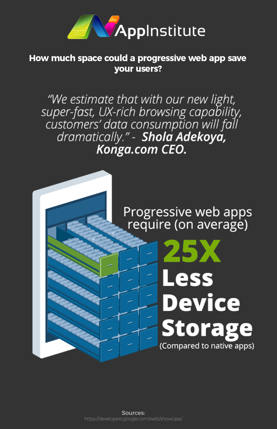
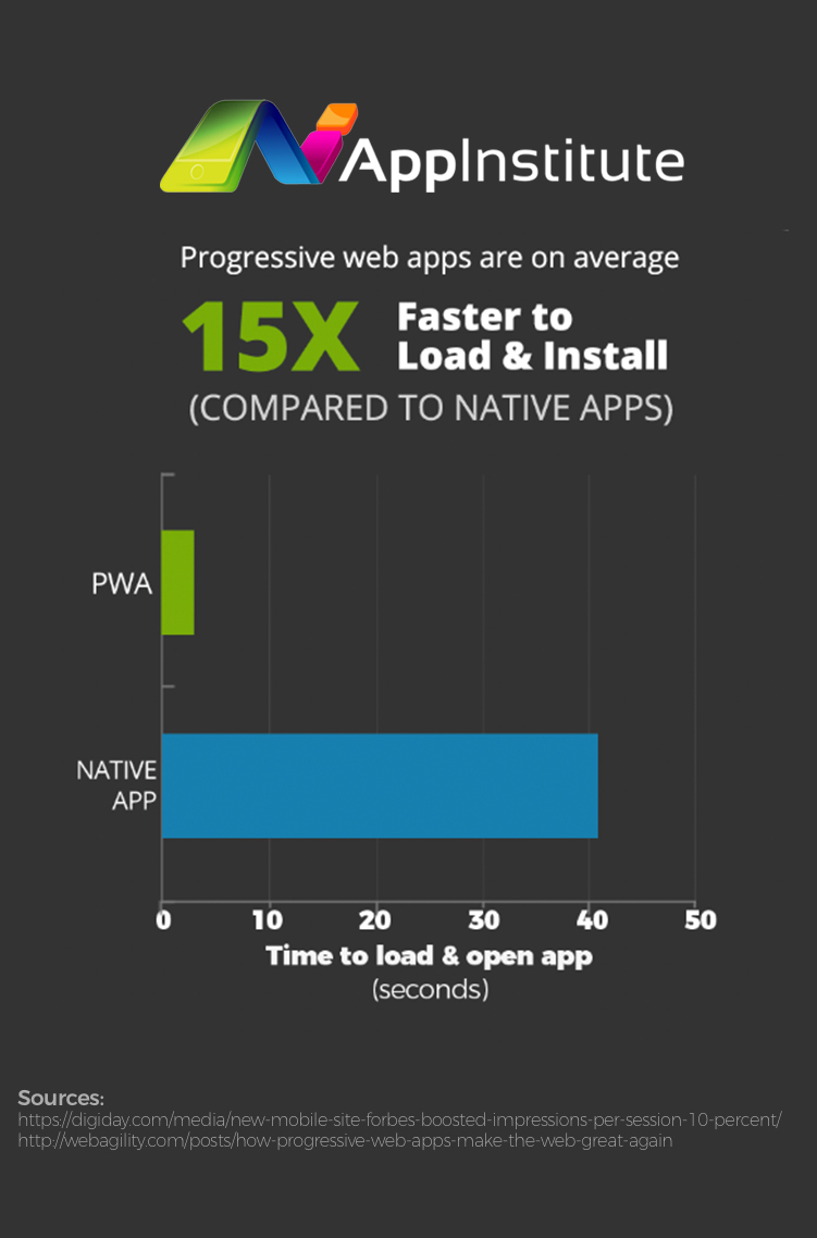
This gives PWAs two key advantages over regular mobile browsing, which are dramatically decreased data usage, and loading times comparable to native apps. It almost sounds too good to be true, because it means that PWAs offer the responsiveness of apps, but straight away from first-time use in a browser. Do they really work?
The proof is in the pudding…
To illustrate our point, we’re using a case study from a website called Konga. You might not have heard of them, but they’re the leading e-commerce website in Nigeria, so they get a fair amount of traffic and attract a lot of users. But because they’re based in Africa, Konga, they actually face some unique challenges.
Nigeria mostly missed out on the desktop PC revolution, so the first experience of the internet for many people is actually mobile. And on top of that, phone signal is remarkably more patchy than in other developed countries, in turn, data costs far more in Africa than it does in Europe. But that’s why a PWA was a perfect idea.

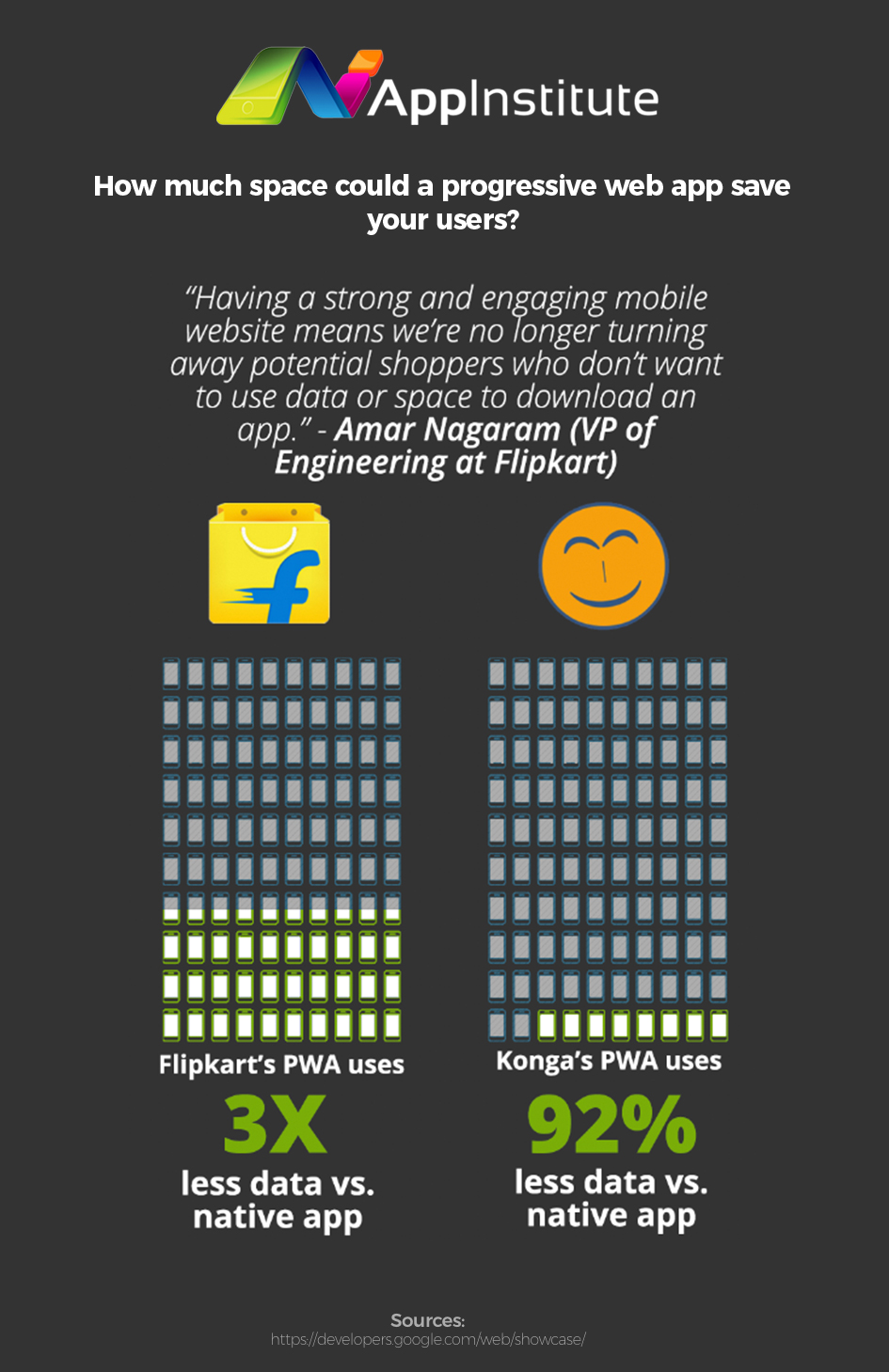
Konga’s PWA was designed from the ground up to tackle these issues. First things first, it uses 92% less data on initial load vs. the native app, and 63% less data than vs. their previous mobile web setup. And users typically use 82% less data before they complete their first transaction vs. the native app, and 84% less than in their previous mobile setup. In essence, the reduced data usage was fantastic for their perfect target audience.
It’s a tasty dish that everyone will like
Another great feature of PWAs is that they’re entirely cross-platform. Even though they’re being pushed hard by Google right now, they aren’t limited to Android phones and they certainly aren’t limited to Google’s Chrome browser, either. They can be used for web browsing on any kind of phone, on any kind of browser.
The bare bones of any PWA are made of super simple HTML, CSS, and JavaScript. Alongside a basic frame that gives the PWA its aesthetics, the service worker, while it’s actually a relatively new idea, is made from very simple JavaScript. If you can’t get your head around how it works, Google has actually made a step by step guide to making your very own PWA, which covers all of the main points.
The gist is that your PWA will have great cross-browser compatibility. And not only that, but you’ll love them too: despite their great functionality, they’re surprisingly easy to code. Google’s guide isn’t just hints and tips. By the end of it, you’ll have made a fully functioning PWA. So you’ve got no excuse to try them out!
The full-fat version just isn’t viable anymore
Responsive and interactive websites are great. But they’re great for desktop, not for mobile. To maximise the outcome of a marketing activity on mobile, it needs to be tailored for the device.

Not just that, but the gap between basic mobile web design and native apps has only been growing. Apps have continually become more interactive, more engaging, and more interesting while mobile browsing continues to be slow and frustrating. But that’s why PWAs are- and get ready for this amazing clichéd quote- the wave of the future, because they offer the best of both worlds.
PWAs offer the same responsive and engaging feel of a native app, and they are also an excellent method of cutting down on data. This applies equally to initial load and continued use, as we’ve illustrated above. So if it’s time that you gave your mobile site a revamp, why not give progressive web apps a try?
To learn more about the PWA features supported by AppInstitute, click here.

2 thoughts on “A Diet for Mobile Apps: Cutting Data Usage with PWAs”