You’re preparing to unveil a significant new feature for your product.
You aim to release this feature flawlessly because you know it has the potential to transform the industry.
As the official launch draws near, your technical team is conducting final testing.
Emails, blog pieces, and updates on social media are just a few of the resources that your advertising agency has prepped. However, in-app messages to enable you to communicate with your active consumers are still lacking, though.
Whether on smartphones, the internet, or desktops, in-app messaging is one of the best tools available to product managers for improving customer loyalty.
In fact, studies indicate that in-app messaging can increase customer retention by as much as 300%. They are eight times more successful at enhancing the customer experience than push alerts.
7 Ways to use in-app messaging for a boost in feature adoption rates
However, there are correct and bad ways to approach integrating in-app communication in your products, just like there are with any other product marketing strategy. In this write-up, we’ll cover seven ways product managers and marketers may use in-app messages to increase feature adoption.
1. Make sure the targeting and grouping are relevant
Priorities first. For whom is this notification of a software update? If you’re unsure, give these three main questions some thought:
- Is your functionality available to all customers or only to those using a particular plan?
- Does it only apply to a specific group of personas or user types?
- Is it intended for advanced users, novices, or everyone?
To encourage adoption among individuals who will gain from the product without upsetting the few who won’t, you should be as specific as you can be when releasing it. Consider your communication strategy for each customer segment.
Distinct user personas can have different goals even when you release one functionality to all consumers. You may improve morale and feature uptake by putting in the effort to create a creative copy that will thrill any user segment.
As per the targeted user segments, shared helpful product advice and reminders through in-app communications. You must convince your customers to opt in before you can expect them to use every new feature.
By responding to frequent inquiries while users are still in the middle of their experience, being active with your in-app notifications can help you prevent negative user feedback and retain clients in the long term.
2. Encourage users to anticipate the feature rollout
If you’re sure that a fresh feature will be useful to the right users, it’s acceptable if your notification briefly interferes with their experience. Revelations of new features that are most successful manage to excite users without overpowering them.
You needn’t describe the functionality in detail in your announcements; reserve it for the guide. Rather, it should convey the most important facts to consumers, such as how this addition would improve their usage of the item and assist them in achieving their objectives.
Here are a few ideas of eye-catching and educational new feature announcements:
- Use phrases like “Latest” or “Unveiling” in your headline to draw the audience in and keep it succinct but descriptive.
- Emoticons can be used to give your header some character.
- Use images or informative visuals to visually sum up the new functionality.
- Be selective with your material and concentrate on the benefits that this release brings to each user’s experience.
- Use a CTA (call-to-action) to send users who are interested in the new feature.
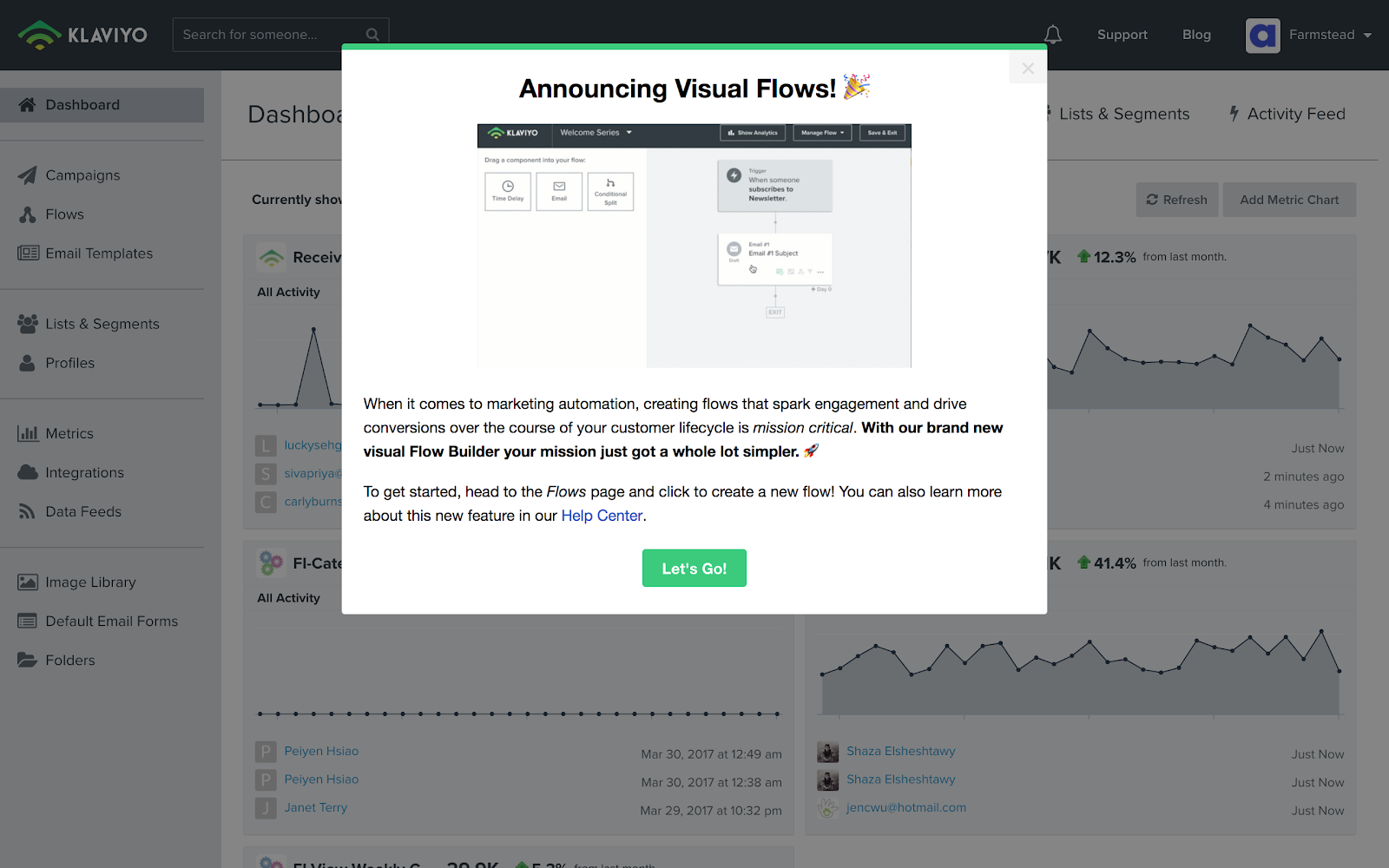
This “Visual Flows” upgrade announcement from Klaviyo is a perfect illustration of an in-app messaging that contains each of the aforementioned components. A clear and instructive title, a picture that shows the new function in operation so that consumers can see how it operates, and — most importantly — a copy that clearly communicates the benefits the new feature offers.

The introduction of Klaviyo’s new feature concludes with a CTA, which directs interested customers to the updated product. The button for Help Center also offers the opportunity to find out more information about the function.
3. Provide product tours and overviews to inform users
Many businesses promote new features with subdued, simple-to-miss banners that direct viewers to blog entries so they can “Learn More.” This tactic fails for a variety of factors. It does not, for one, have the same impact that a modality does.
Banner ads should only be used for small product updates because they are simple to miss.
But what’s the true issue? Diverting a consumer away from your brand completely kills momentum and keeps them from interacting with your software update.
Choose an in-app product tour or overview as an alternative so that consumers can start interacting with and using your new update while still remaining within your app. Uncertain of what this encounter should involve? Put in place a test run and document the user’s queries and initial steps.
Alternately, observe your CSMs (Customer Success Managers) as they walk a user through the functionality during a session. CSMs have diligently spent countless hours on their phones convincing each customer of your additional features. Via in-product interactions, their natural abilities to convey the product value rapidly may frequently be repeated and scaled.
You can scale this encounter for all your customers, such as the users without dedicated customer success managers, by using interactive feature tutorials to lead your clients through the workflow with a contextualized example exactly like a CSM would.
4. Personalize it
Users are constantly exposed to marketing messages, let’s admit it. For many SaaS customers, it has reached the stage where the majority of that messaging — even the crucial information—by default drifts into the backdrop. Humanizing your message is one method to overcome this obstacle.
When Airtable released a series of Airtable Blocks, they used this strategy, having one amongst their teammates convey the message:
- Airtable prevents the release of additional features
- Airtable prevents the announcement of new features and built-in feedback
This notification sticks out because it reads more like a kind communication from a friend than like a faceless advertisement. The youth claim that it strikes them differently. Emoji-based feedback requests are also present in Airtable. An innovative strategy that enables Airtable to set a baseline for user feelings regarding this product is to include a call for input immediately in the announcement.
5. Blend UI (User Interface) elements to provide more encouragement to users
Modals and chatbots are fantastic for making a major statement and supporting users, but it’s much more effective to follow up with a popup while a customer is still actively using your app. Combining the two might provide users with the extra push they require to move forward and begin forming new habits.
Modals command attention and are by design obtrusive. It’s crucial that you save modal usage for your most crucial messages as a result. The time and target audience must both be taken into account. Whenever a customer first enters your application and then before they begin a workflow, some modal messages could be better given upfront.
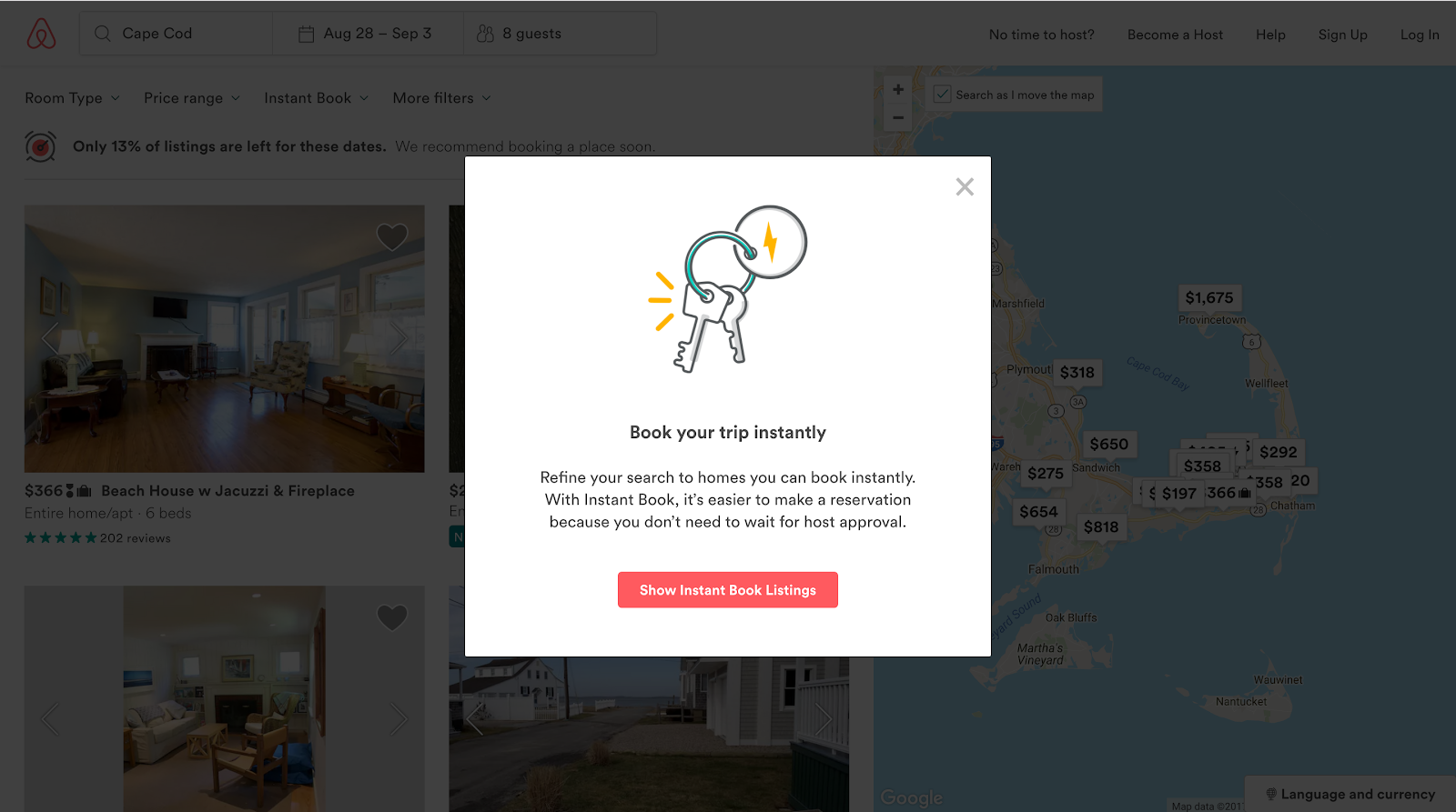
Small patterns called tooltips provide contextual cues. Tooltips are ideal for highlighting specific UI components and for guiding users through the process of using a major feature series of steps. Modals and tooltips work together to deliver a powerful one-two punch. Airbnb provides an example of how to use both UI approaches successfully:
Airbnb’s in-app notification announcing a new feature:

When introducing their Instant Book function to users, Airbnb employed a modal. A subdued tooltip appears while people navigate the platform immediately after this. Customers don’t require a lot of details in the tooltip since they have previously been made aware of the novel Instant Book function and have been readied for it. An extra push for feature adoption can instead be provided by a straightforward, contextual reminder.
6. Evaluate your outcomes and improve

You should gauge both flow completeness and major feature uptake whenever it pertains to upgrade launches.
Your workflow completion rate can be analyzed to find out where users are leaving off. It’s possible that the messaging or instructions are unclear. Maybe you’re picking the wrong users to target. You may optimize and enhance the process of releasing features over time by identifying the areas that need improvement.
There is no one-size-fits-all metric for gauging feature uptake. In the end, it will have to depend on how you gauge engagement. Here are some potential metrics to consider:
- % of users who have used the new functionality
- % of people using the feature 2+ times or more
- Users’ level of engagement with newly implemented features
7. Prepare for tomorrow’s registrations
Future signups, arguably the most crucial components of this product announcement, are not yet available. Be sure to take into account how customers will first experience the functionality in the future.
Is it a key component of your product’s foundation? If not, you can think about delaying its introduction to newbies until they’ve gotten used to its basic features. Too soon adding complexity risks overwhelming users. On the other side, you might need to change your user onboarding process to incorporate this feature if it is directly connected to the main use case for your product.
Conclusion: Establish a consistent messaging plan
Nobody likes utilizing things that haven’t been updated in a while. New features can re-inspire consumers by emulating the “aha” moment that convinced them to start using your company’s products. This shows that your business is changing to satisfy user needs.
Iterative testing may be required to determine the most efficient in-app messaging, nevertheless. You should therefore experiment with various strategies in order to develop a repeatable plan that is effective for your product.
There is no better moment than the present to begin refining that approach.
Author bio
Atreyee Chowdhury works full-time as a Content Manager with a Fortune 1 retail giant. She is passionate about writing and helped many small and medium-scale businesses achieve their content marketing goals with her carefully crafted and compelling content. She loves to read, travel, and experiment with different cuisines in her free time. You can follow her on LinkedIn.
0 thoughts on “How Can You Use In-app Messaging to Increase Feature Adoption?”