
Your restaurant menu design is important for several reasons.
First is that people use your menu when deciding where to eat. Once they’re interested in your restaurant, they search online to find out more about your food.
People may also want to order directly from the online menu. To offer this service, you’ll need an online ordering platform.
Once in your restaurant, menus play a large part in helping diners decide what to eat. You can use images, descriptions, nutritional information, and more to help. Remember that the placement of items and offers can increase the amount customers spend.
The best way to gain inspiration for your restaurant’s menu is to see what others in the industry are doing. This article contains 13 restaurant menu examples you can use to get ideas.
We’ve included both website menus and PDF menu designs to inspire you no matter which type you want to create.
13 Restaurant Menu Examples
Nando’s – Easy Ordering
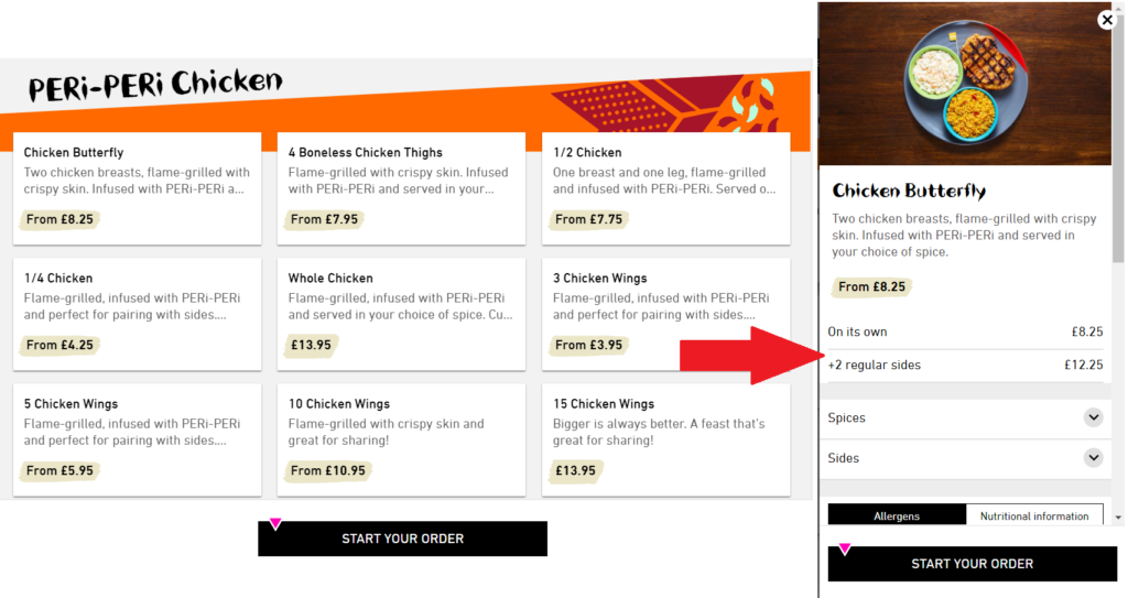
Peri-peri chicken restaurant Nando’s has an excellent online restaurant menu. It’s easy to use, contains all the information a diner needs, and simplifies ordering.
The page is organized into categories which makes navigation easy. Each menu item has the name, price, and a short description of the food. When you click on a meal, you can see an image and further information about the food, including nutritional content.
Once the diner has chosen their food, it’s easy to order directly from the menu. Just click the “Start your order” button. The website then guides you through the process of ordering.
Five Guys – Instantly Recognizable Menu Design
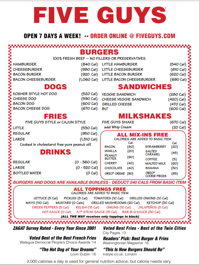
This Five Guys hamburger menu is an excellent example of a simple and effective menu design. The color scheme and the font instantly mark it out as belonging to the burger chain.
We particularly like that the menu highlights how many calories each item contains. This helps customers make informed dietary choices.
The bottom section is another highlight. Five Guys added six prominent reviews and awards that show how great the food is.
Brewdog – Easily Updatable App

There’s a lot to like about the craft beer chain Brewdog’s different menus. But we particularly like the in-app beer menu.
The beers available at the chain’s multiple locations are continually changing. Having the tap list in an app means the pub can easily update it whenever a new beer comes in. People just need to check their phones to see what drinks are available before they visit.
The tap list also includes information about each beer. It shows the type, alcohol percentage, and the Untappd rating. App users have access to other useful features, including the ability to book a table, browse a food menu, and get directions.
Click here to find out more about building an app for your restaurant
Domino’s – Easy Customization

The Domino’s menu stands out due to the comprehensive customization options. Once you’ve selected a style of pizza you can choose the size, crust, cheese, toppings, sides, and more.
The menu ensures diners have access to the same options when ordering online as they do in the restaurant. It also provides plenty of opportunities for the chain to upsell different items and increase its average order size.
Pizza Express – Tasty Images and Descriptions

Pizza Express takes a different approach to pizza menus. As a mainly dine-in restaurant, the website menu needs to be optimized to encourage people to visit a location rather than order takeaway. It does this by making the food seem as appealing as possible.
The menu is organized into categories. You can easily navigate between different types of food. Each item has a mouth-watering picture and description. You can also see information like whether the food is suitable for vegetarians or vegans.
We like that the newest items are placed at the top of the menu, so repeat customers have something new to look forward to.
Outback Steakhouse – Accessible Offers
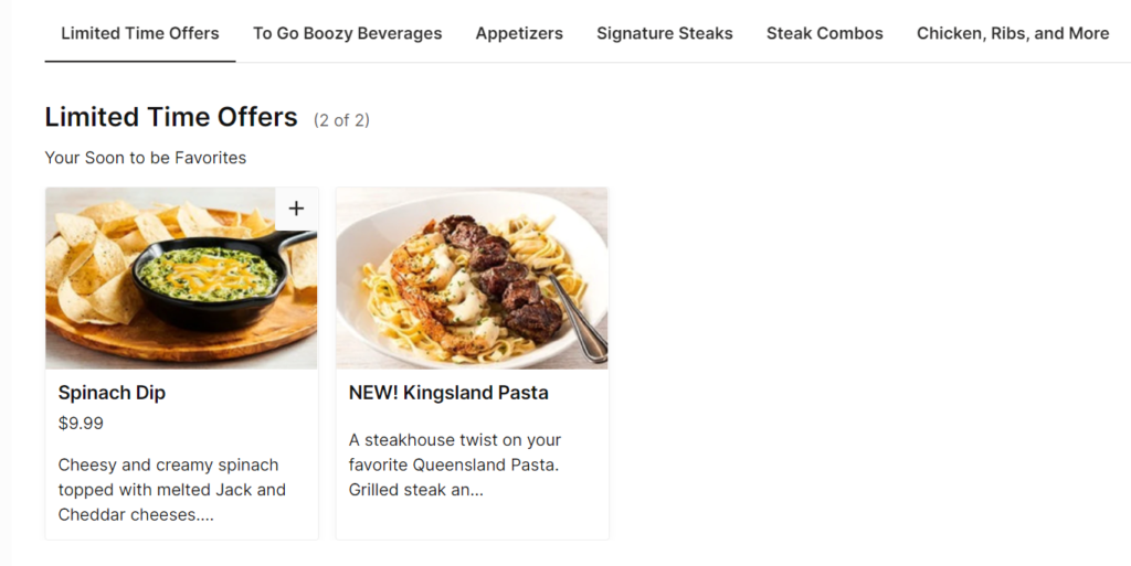
Outback Steakhouse has an easy-to-navigate online menu with appetizing images and descriptions. It’s easy to get more information about each item, and you can even order from within the menu.
We particularly like the limited-time offers section. This highlights the special offers that are available at each restaurant.
It would be easy to add a similar section to your website menu. Use it to promote new menu items, meal deals, discounted sides, or anything likely to encourage people to eat out and spend more.
Subway – Visible Nutritional Information
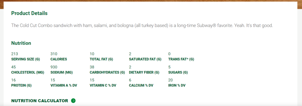
Subway has an online restaurant menu that is easy to navigate. Each item has an image and description, which makes the food seem appealing.
We particularly like the detailed nutritional information the chain provides.
Subway has a reputation for being a place to get healthier fast food. Including nutrition information is key to helping the chain’s customers make better decisions.
Flat Iron Steakhouse – Supplier Story

Flat Iron Steakhouse has a distinctive, simple menu. It’s well-organized and contains the prices of each item. However, the stand-out part of the menu is the “Our Suppliers” section at the bottom.
Here the restaurant lists all the farms it buys ingredients from. It also provides information about each one, such as who runs it and why they are good to work with. You can even visit the farms’ websites via a link on the menu.
Dishoom – A Clever Concept
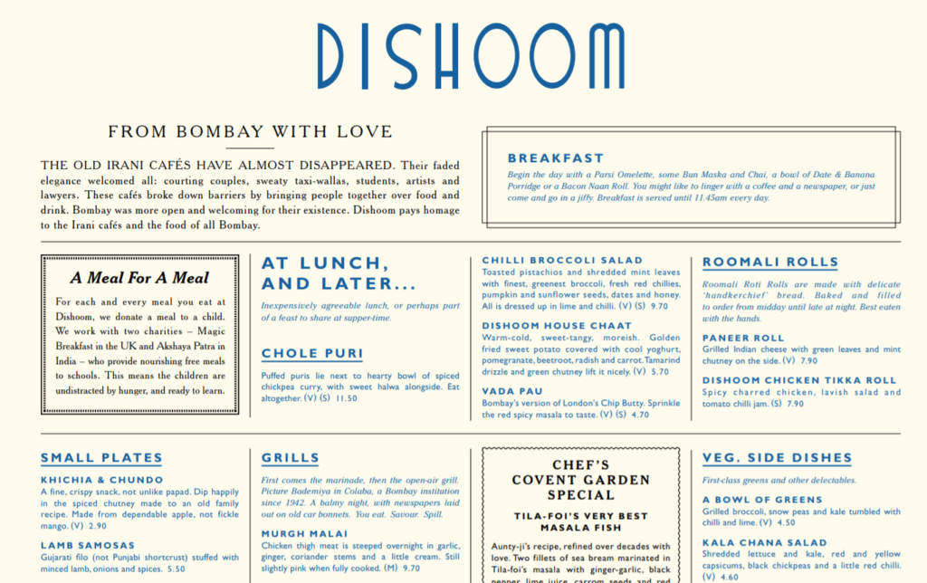
Indian restaurant Dishoom has a beautiful, well-designed menu. We particularly like how the menu uses the introduction at the top to draw diners into the theme. The introduction to the restaurant’s charitable donations is also an interesting section.
The Fat Duck – An Element of Mystery

Heston Blumenthal’s The Fat Duck is known for its innovative, experimental food. It’s no surprise that the menu also stands out.
The restaurant is currently celebrating 25 years since it opened, a concept that is reflected in the menu.
The menu itself does away with many of the things you’d expect to see. There are no descriptions or images. Instead, the diner is left looking at menu items with names such as “Damping through the Boroughgroves 2015” and “Like a kid in a sweetshop 2006.”
This menu design doesn’t tell you much about the food. But it adds a ton of intrigue, which is part of the restaurant’s appeal.
Le Bernardin – Simple, Classic Menu Design

New York City restaurant Le Bernardin has perhaps the simplest menu on this list. This style choice reflects the needs of fine dining restaurants.
The page shows a list of items with a short description of each one. The menu design is black text on a plain background with plenty of white space.
The menu seems pretty limited compared to some of the feature-packed menus on this list. But it is designed to let the food do the talking, and it likely appeals to the people that typically eat at the restaurant.
Pie Minister – Excellent Menu Items Layout
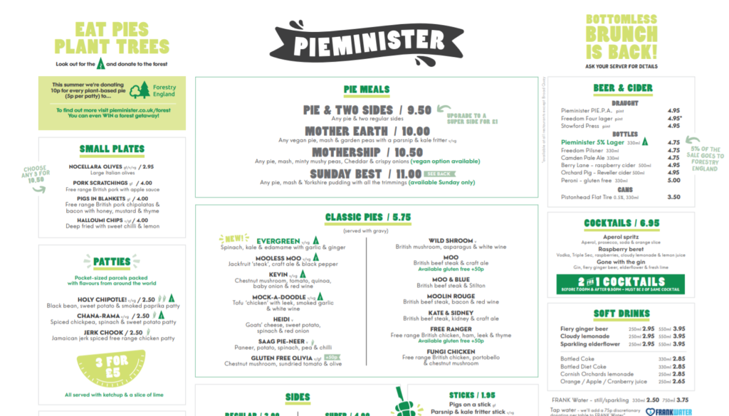
Pie Minister has a great example of a well-laid-out, single-page restaurant menu. It uses the layout to highlight the most important parts of the menu.
For example, the “Pie Meals” section is placed in the center at the top, which is the first place most people look.
Below this is the list of pies. Sides and drinks are spread out around the rest of the page. There’s even a bottomless brunch offer in the top right corner and details of the company’s charity work on the left.
We also like that the restaurant has added plenty of personality to the menu.
The names of the dishes and meals are funny. Calling the meals “Mother Earth,” “Mothership,” and “Sunday Best,” is more impactful than simply calling them “Small,” “Medium,” and “Large.”
Alegrias – Likes and Reviews

Spanish restaurant Alegrias has a simple menu with one feature we like in particular—the option for people to like and review each item.
This is a social element that tells other people more about the food beyond the restaurant’s own description.
It’s also easy to book a table at the restaurant from within the menu.
Now It’s Time to Design Your Own Menu
The restaurant menu examples above have hopefully provided all the inspiration you need for your menu design. Just think about the features and elements you want to add to your own menu.
If you need help with menu design, you have plenty of options.
Canva has templates that make designing PDF or printable menus a breeze, while AppInstitute is a complete solution that lets you create online and app-based menus customers can use to order food directly.
Find out more about using AppInstitute for online ordering here.
0 thoughts on “13 Mouth-Watering Restaurant Menu Examples”