The true purpose of an onboarding process is still education, but while this was once focused on helping users understand how to use the app, it has now shifted to showing users the benefit and value in using the app. And the benefit of a good onboarding process for you is happy customers who keep using your app and a solid onboarding experience can increase retention rates by up to 50%.
In the early days of smartphones and app stores, onboarding screens were essential. The primary purpose then was to help users understand how the app worked, and how to navigate through the app. But both the Apple App Store and Google Play have been around for more than 5-years, and there are now more than 2-billion smartphone users worldwide. Which means that educating users on how your app functions is no longer essential.
But this does not mean that there is no benefit in including onboarding screens when your app launches for the very first time. Most smartphone users will be quite comfortable with exploring your app on their own, but they won’t all be aware of what benefit and value your app offers to them. Yes, you can – and should – list these in your app’s description, but if you assume that not everyone will read your app’s description in full, or that they may have forgotten what they read by the time they launch your app for the first time, a short series of onboarding screens will be most welcome. With emphasis on the short.
“Here’s what our product can do” and “Here’s what you can do with our product” sound similar, but they are completely different approaches.
— Jason Fried (@jasonfried) November 13, 2013
Jason Fried’s words are as true now as they were in 2013. A great onboarding process shows benefits, not features.
The AppInstitute app builder limits you to 6 onboarding screens which can be added using the About Tab. You can customise these screens anyway you want – the builder supports static images, videos, animated gifs, and full HTML – there are some common best practices you should follow. In this article, I will discuss them, along with ideas of how you could implement onboarding screens in ways that benefit you and your customers.
Here are two types of onboarding experiences commonly used in mobile apps:
- Benefit-directed onboarding – This type of onboarding focuses on highlighting the value the app offers to users.
- Function-directed onboarding – This type of onboarding focuses on demonstrating the core features of the app.
Most retail and services mobile apps – especially for small and medium businesses – are not overly complex. Which means that benefit and function oriented onboarding is all that is needed.

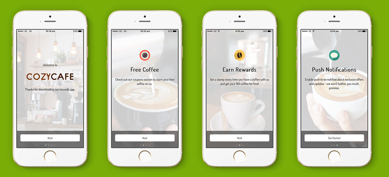
Your app introduction screens can be a simple overview of the benefits of downloading and using your app with a reminder to enable push notifications.
One of the best features of having your own mobile app is the ability to market directly to your customers via push notifications. But simply asking users to enable push notifications is far less effective than first giving them some indication of how they could benefit from enabling them. Even if you decide to forego a series of onboarding screens, you should have a screen which encourages users to enable push notifications. Include brief information on how frequently users can expect notifications from you, and what they might include. And if you require users to register via your app, then include a screen that explains this, along with what info you require, and why. Ideally, this screen should be the last one, and from this screen users should be taken directly to the registration/login screen.
When it comes to deciding what benefits and value your app offers, it helps to involve your customers in the process. If you have already launched your own app, you can look at your app analytics to see which sections and features of your app are most popular with users. And if you are still in the process of developing your own app, expand your research to look at what features your customers would be most interested in. Depending on your industry, these may include features such as a loyalty programme, or the ability to make bookings online. For restaurants and takeaways that offer a delivery service, highlighting this may appeal more to customers than a loyalty programme. But you won’t know without a bit of research beforehand.
5 Best Practices for Mobile App Onboarding Screens
It is only once you have established the value and benefit of your app from your customers perspective that you can begin creating your onboarding screens. But as mentioned earlier, there are some common best practices to consider when designing these screens.
1. Consistent Branding
Make sure the onboarding experience matches your app and your brand. Use the same design style and tone of voice found in your other branding assets.
2. Keep It Simple
The whole onboarding process should be fast and simple. Include buttons or text that allow users to skip the entire process, or navigate to the next screen. It is also helpful to include some indication of how many screens there are.
3. Sell The Benefits
Focus on value and benefits, not function. Salons, restaurants, and spas should lead with their app’s online booking features if offered. Businesses with a loyalty programme should emphasise this, and how easy it is to use with the mobile app. This not only encourages users to take the next step but by giving them a high-value reason to use your app, you also promote app retention.
4. Don’t Ask For Too Much
If you require users to register in order to use your app or certain of its features, only ask for the information you need. For loyalty programmes and online booking this shouldn’t be more than a name, email address, and mobile number, but for businesses offering deliveries via their app, this would extend to include a physical address. Asking for too much information can turn users away.
5. Keep It Short
Use as little text as possible. Remember you are able to use animated gifs and videos instead of static images, so focus on showing rather than telling. Even then the videos and gifs should not be too long, and consider including a small timer in the video so users know exactly how long the video is.

7 thoughts on “How to Create a Great Mobile App Onboarding Experience”